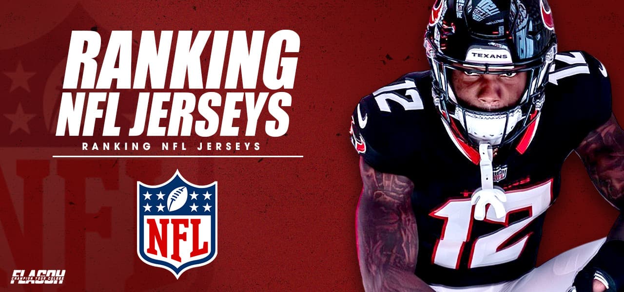
Rivalry games don’t just define NFL seasons—they also deliver some of the most memorable visuals on the field, where the real debate is not only who wins, but whose uniform looks better. In this guide to ranking NFL jerseys, we break down the best rivalry looks using clear design criteria such as color contrast, typography, helmet integration, and broadcast visibility. That way, you get a cleaner way to judge the matchups you love and fresh style ideas you could echo with brands like FlagOh Fanatics.
How We Ranked NFL Jerseys In Rival Matchups
To keep ranking NFL jerseys in rival matchups fair and consistent, we scored each look on three things: clear color contrast between rivals, readable numbers for fans in the stands and on TV, and a unified helmet–jersey–pant silhouette that really pops—similar to how FlagOh Fanatics thinks about building rivalry-inspired designs that feel instantly recognizable.
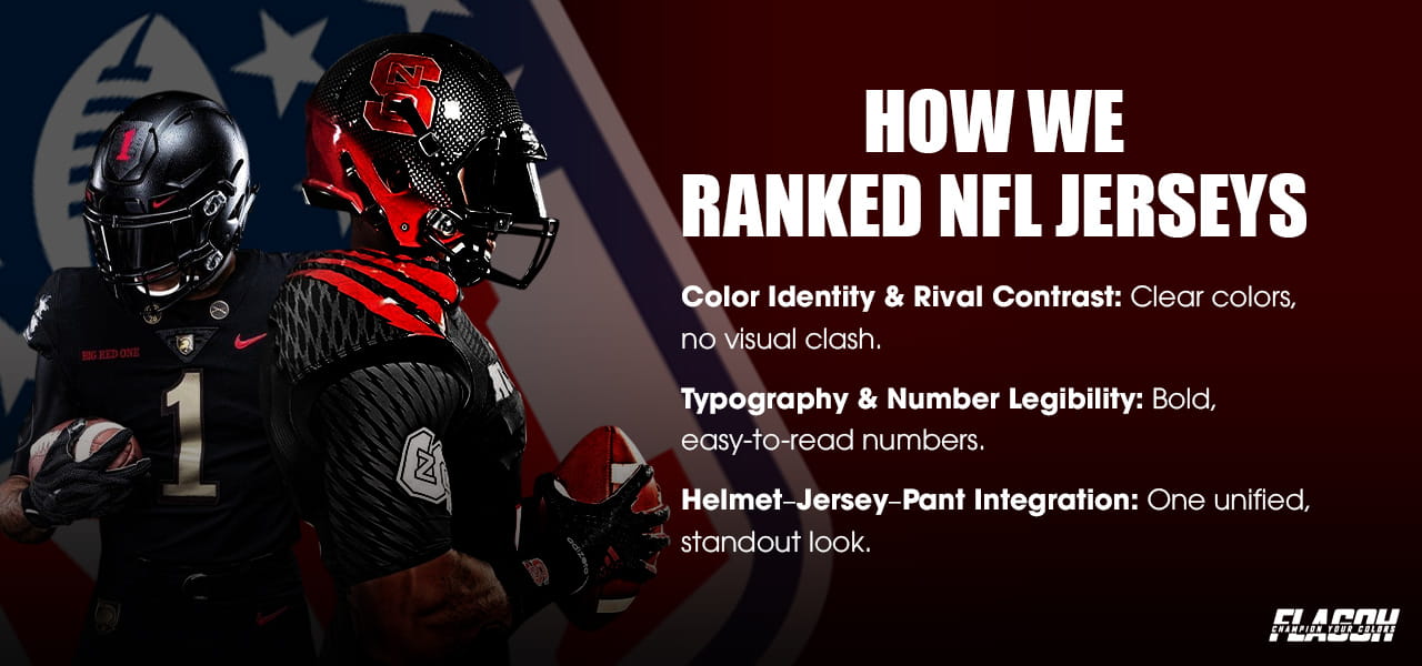
Color Identity & Rival Contrast:
Strong color contrast makes it easier to tell teams apart and avoid “clash confusion” during games. The W3C suggests a minimum contrast ratio of 4.5:1 for things to be clearly visible, and many of the best NFL uniforms meet or beat that standard. That’s why rivalries like Steelers vs Ravens and Packers vs Bears are so visually clear and satisfying to watch.
Typography & Number Legibility:
For TV and in-stadium clarity, jersey numbers should stay easy to read from roughly 50–70 feet away so viewers can instantly recognize players. That’s why details like outlines and subtle drop shadows play a bigger role in night games or indoor stadiums—good edge definition keeps the numbers from blending into the jersey, even under harsh or uneven lighting.
Helmet–Jersey–Pant Integration:
When the helmet, jersey, and pants work together, the entire uniform forms a clean, unified silhouette that stands out immediately on the field. With the NFL allowing teams to use an additional helmet design for throwback looks, franchises like the Eagles, Buccaneers, and Seahawks can now recreate their classic styles more accurately—giving rivalry games an even stronger visual impact.
Ranking NFL Jerseys From Worst to Best
In this section on ranking NFL jerseys in classic rival matchups, we stack seven rivalry looks from worst to best based on design, readability, history, and overall visual impact. For clarity and depth, this guide focuses on a select set of classic rivalries rather than ranking every matchup in the league.

Giants vs Cowboys
The Giants come out ahead (8.7/10), with bold primary colors and strong stadium visibility that really stand out under the spotlight of NFC East showdowns.
Jets vs Patriots
The Jets win this one (8.8/10) as their Legacy Green redesign adds sharp contrast, cleaner lines, and a stronger personality to the rivalry.
Cowboys vs Eagles
The Eagles edge this matchup (9.0/10) thanks to modern midnight green, sharp outlines, and crisp numbers that give their set a sleek, updated feel.
Bears vs Packers
The Packers come out on top (9.1/10) thanks to their iconic green–gold palette and clean, timeless striping that stands out in every rivalry meeting.
Chiefs vs Raiders
The Raiders claim the style battle (9.2/10) through pure silver-and-black minimalism, delivering a bold, no-nonsense look that feels instantly iconic in every AFC West clash.
Steelers vs Ravens
The Steelers take the style win (9.3/10) with a high-contrast black-and-gold look whose bright accents pop on broadcast, especially in intense night games.
49ers vs Seahawks
The 49ers dominate here (9.4/10), with red-and-gold heritage, balanced striping, and a classic silhouette that creates one of the strongest visual identities in the league.
Coolest NFL Jerseys For Throwback And Modern Rivalry Matchups
When it comes to some of the coolest NFL jerseys worn in rivalry games, the most striking designs usually fall into two categories: throwbacks that revive a classic identity and modern redesigns that sharpen how those same matchups look on the field today—an approach also seen in how brands reinterpret classic color cues and rivalry themes for fans.
Throwback Jerseys That Outshine Modern Sets:
- Eagles Kelly Green: The Eagles’ Kelly Green throwback is a near-perfect revival of their classic identity, with rich green tones that pop against white helmets and silver pants. In NFC East rival games, especially versus the Cowboys and Giants, it delivers a sharp contrast and instant readability both in the stadium and on TV.
- Buccaneers Creamsicle: The Buccaneers’ Creamsicle throwbacks pair soft orange with white in a way no other NFL team even tries to copy. Their warm, retro look turns rivalry matchups into something instantly recognizable, while simple striping and logos keep the uniform memorable without feeling busy.
- Oilers (Titans) Throwback: The Oilers-inspired Titans throwback uses powder blue, red accents, and clean white helmets to tap straight into nostalgia. Against opponents like the Cowboys and Steelers, the set stands out with smooth color balance and a strong sense of history that fans immediately connect with.
Modern Redesigns Changing Rivalry Dynamics:
- Jets Legacy Green: The Jets’ Legacy Green update brings back a cleaner, retro-inspired look with sharper striping and a more defined silhouette. The deeper green tone creates a stronger contrast against divisional opponents, and the simplified lines help the uniform read clearly on both daytime broadcasts and night games. It’s a design that feels refreshed without losing the team’s identity.
- Broncos Uniform Overhaul: The Broncos’ recent redesign introduces bolder geometry, clearer number shapes, and a brighter overall contrast that stands out immediately in AFC West rivalry games. The updated paneling along the jersey and pants creates a more athletic, streamlined feel, giving the whole set a modern edge without overwhelming the traditional orange-and-blue identity.
- Lions Chrome Helmets: Detroit’s chrome helmets add a striking metallic finish that elevates their entire uniform. The reflective surface increases visibility under stadium lighting and gives the team a distinctive look that pairs well with both their classic blue and alternate sets. It’s a small change with a big visual payoff, especially in high-profile rivalry matchups.
Why Some NFL Jerseys Look Better In Rivalry Games
Some NFL jerseys naturally shine in rivalry games because color, lighting, TV cameras, and fan memories all work together, making certain looks feel sharper, louder, and more iconic every time those matchups happen.

Color Theory & Stadium Conditions:
Grass and turf can change how bright a jersey appears by as much as 15 to 20 percent due to differences in surface reflectivity. Teams with deeper, more saturated colors like the Vikings and 49ers tend to stay visually clear on either surface, keeping their uniforms sharp and readable in any rivalry setting.
Broadcast Visibility & Camera Rendering:
HDR cameras tend to amplify bright tones, which is why high-contrast uniforms like the Steelers or Chiefs often look even stronger on broadcast. In contrast, darker jerseys without clear outlines can lose definition at a distance, causing numbers and details to blend into the fabric—something that affects a few modern redesigns more noticeably during night games or indoor matchups.
Fan Perception & Memory Bias:
Historic rivalries leave lasting emotional marks on fans, who often connect specific jerseys with unforgettable wins and defining eras. The 49ers’ red-and-gold instantly recalls the dominance of the Montana–Rice years, while the Steelers’ bold gold accents evoke memories of championship runs and a hard-hitting identity that shaped the AFC for decades.
What Makes The Perfect NFL Jersey?
When you are ranking NFL jerseys in rivalry games, the very best designs all nail the same core fundamentals. A perfect jersey is not just about having cool colors; it is about how every detail works together to create a clear, memorable, and wearable identity on and off the field.
- Consistency: Helmet, jersey, pants, and socks should share the same design language so the uniform reads as one complete idea, not four separate pieces. When stripes, colors, and finishes feel coordinated instead of random, the team’s look becomes instantly recognizable in any rivalry game.
- Readability: Clean fonts with solid outlines or subtle shadows help numbers and names stay clear from every angle, whether you’re in the upper deck or watching on TV. Good readability also makes highlights and replays easier to follow, which quietly reinforces how “big-time” a uniform feels.
- Contrast: A strong, distinct color identity keeps a team from visually blending into its opponent or the field. Clear contrast between jerseys, pants, and helmets makes movement easier to track and gives rivalry games that extra visual punch fans expect when two long-time opponents meet.
- Legacy Value: Uniforms that connect back to iconic players, legendary coaches, or famous seasons carry extra emotional weight. When fans see a design that reminds them of a dynasty run or a signature rivalry moment, the jersey stops being just clothing and becomes part of the story.
- Wearability: The best NFL jerseys don’t just look good on the field — they also work on fans in the stands, at home, or in everyday streetwear. Balanced colors, flattering layouts, and versatile styling make it easier for people to build outfits around their team, turning a great rivalry look into something they actually want to wear year-round.
Quick Answers On Ranking NFL Jerseys
A few quick FAQs to help you see rivalry uniforms with a sharper eye, from design basics to how they actually look under real game-day conditions.

How do you compare NFL jerseys in rival games?
By judging color contrast, number readability, overall balance, and rivalry fit.
What makes a rivalry uniform look bad?
Low contrast, cluttered details, and hard-to-read numbers hurt the look.
Which rivalries need a uniform redesign the most?
Matchups like Cardinals vs Falcons or Commanders vs 49ers are prime candidates, because their similar dark reds and layouts can blend and would benefit from a clearer, cleaner redesign.
Which jerseys are easiest for fans to wear on game day?
Clean, high-contrast designs with simple fronts and balanced colors.
Does stadium lighting change how rivalry jerseys look?
Yes, it can brighten, flatten, or glare colors, affecting clarity.
If you love ranking NFL jerseys and really win the style battle, don’t stop at this list—explore more rivalry-inspired colors, matchup concepts, and jersey style ideas with the FlagOh Fanatics, and find looks that actually fit your favorite team and how you like to wear it.